Omnipass
Reimagining citizenship as a subscription service (CaaS)
Stakeholders
Career Foundry
Front End for Designers
Project Role
UX/UI Designer and Project Lead
Tools Used
Figma
Visual Studio Code
Github
Adobe Illustrator
Photoshop
Midjourney
Key contributions
HTML, CSS, JS
User Personas
Flows
Wireframing and Prototyping
Usability Testing
Branding & Emotional Design
The challenge
Develop a responsive web experience to make it easy for users to learn about and apply for a subscription plan.
Design Fiction, Alternate Futures
Background
OmniPass is a speculative project that reimagines citizenship as a service model. The idea critiques traditional notions of nationality and mobility by proposing a membership-based service.
The Process
My process for OmniPass used a design fiction approach to speculate about the implications of a Citizenship as a Service (CaaS) model. I began product ideation, by drawing from previous experience to create speculative scenarios and user stories. These scenarios helped define user journeys, structure the information architecture and developed wireframes, from which I write the foundational HTML, CSS, and JavaScript for an MVP.
This initial build enabled a usability study, where I identified areas of friction and generated an error report, which informed refinements for the final design.
Define
Exploring Use Cases
Insight # 1
Different plans for different needs
People have diverse needs from temporary relief to long-term settlement. How can we rethink a the citizenship model to support those needs?
Idea: Provide different plans to allows users to select the services they need.
Insight # 2
Account for affordability
People plan citizenship options based on price points. Would a pay as you go system afford them flexibility?
Idea: Incorporates a daily fee structure, enabling users to subscribe only for the time they require.
Insight # 3
Rethink ID verification systems
Traditional forms of ID verification may not always be accessible. What other id verification processes could be put in place?
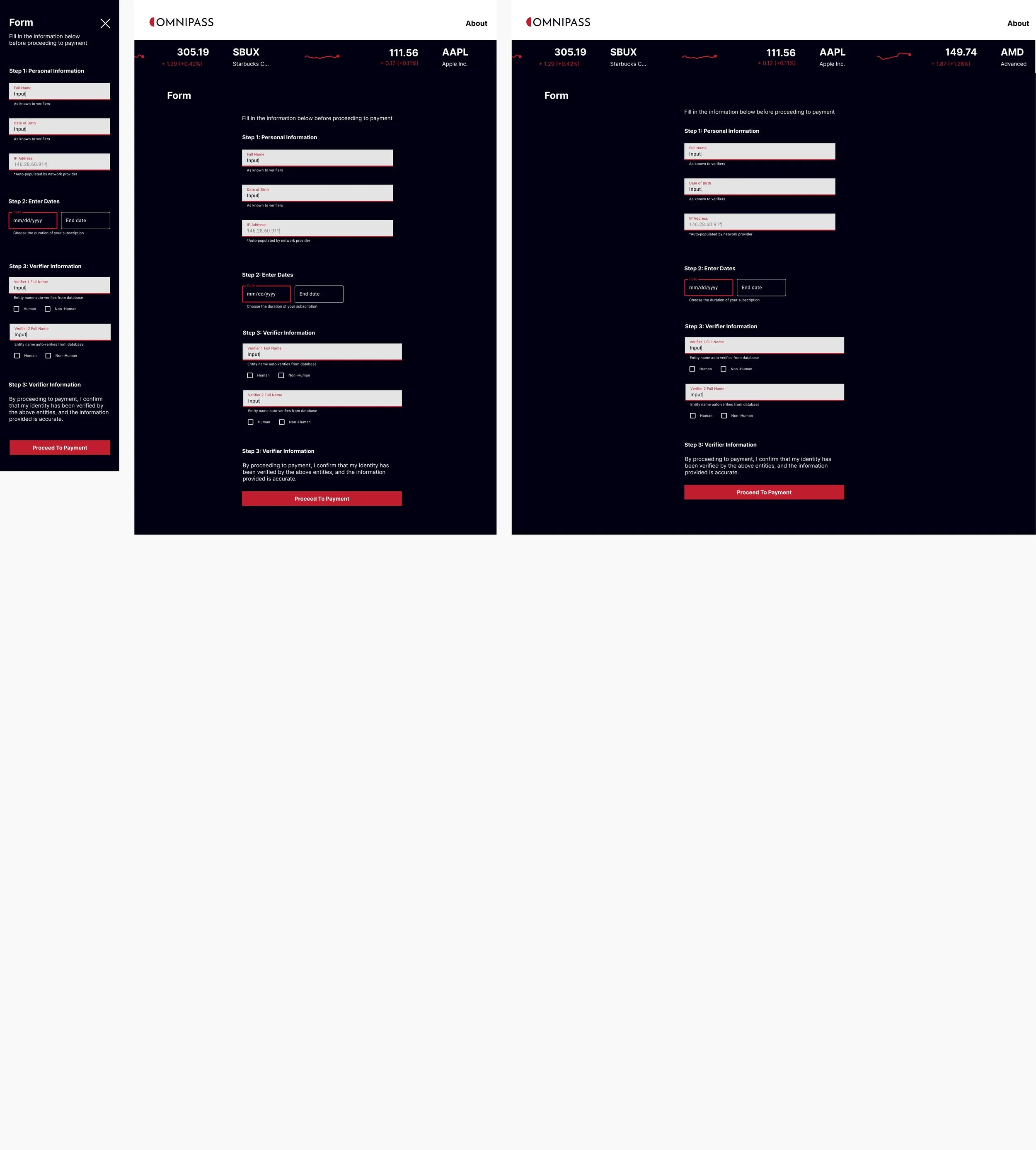
Idea: Explore peer-based identity verification system where users can validate each other’s identities, utilizing both human and non-human verifiers.
This user stories are inspired by real experiences and people I’ve encountered in my own journey through various migration systems worldwide. This project does not seek to trivialize or diminish the profound challenges and suffering faced by those affected by migration. Instead, it serves as a edge case study, highlighting the potential extremes of control over identity and the impact of those systems on people.
Ideate
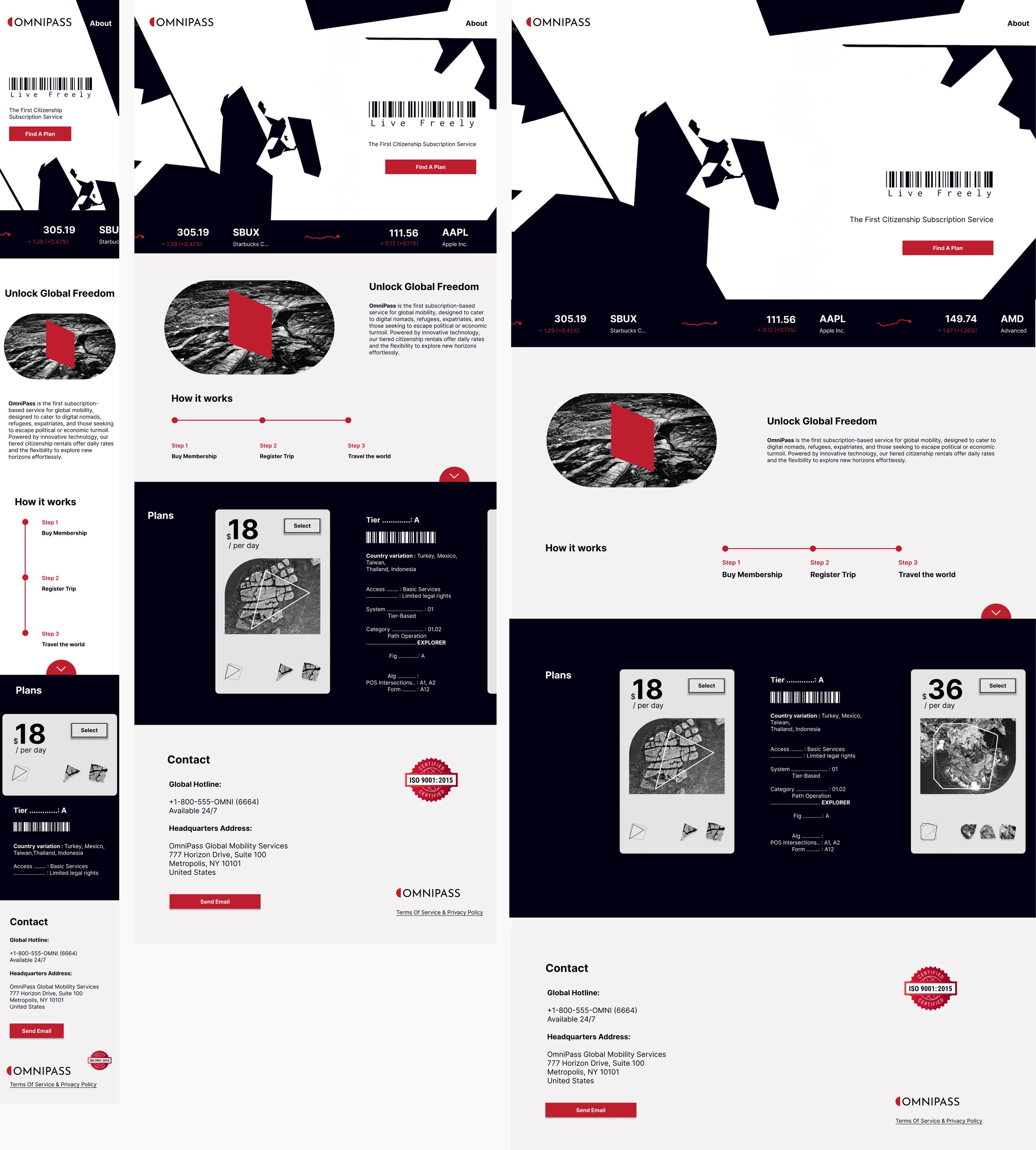
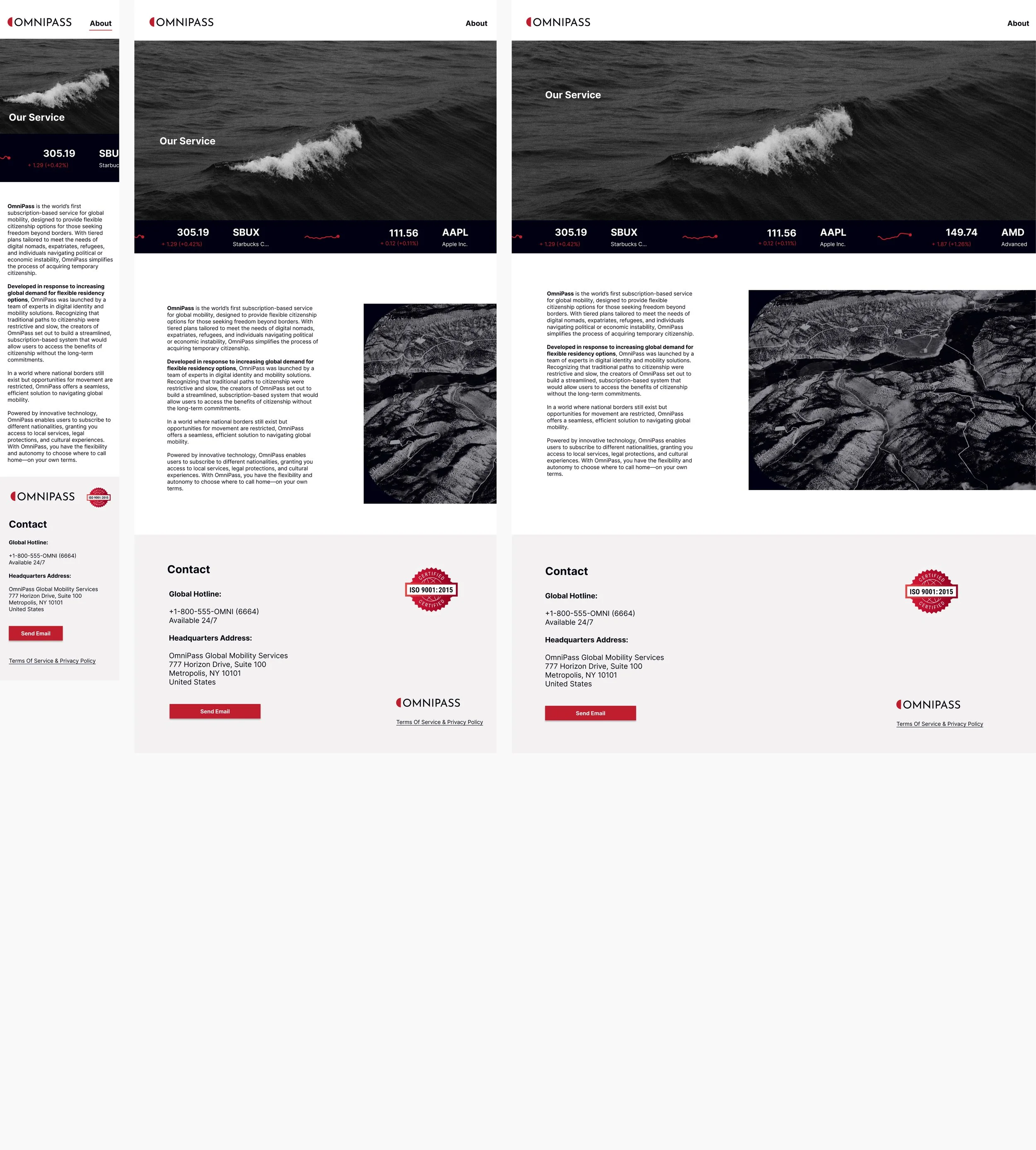
From Ideas to Wireframes
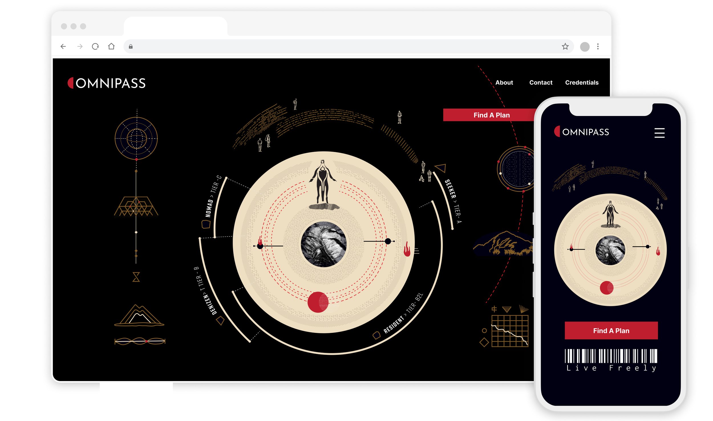
This design draws inspiration from an a techno-baroque aesthetic that merges futuristic fuctionalism with corporate symbolism. Dark tones, geometric patterns, and layered visuals.
Develop
From Wireframes to Code
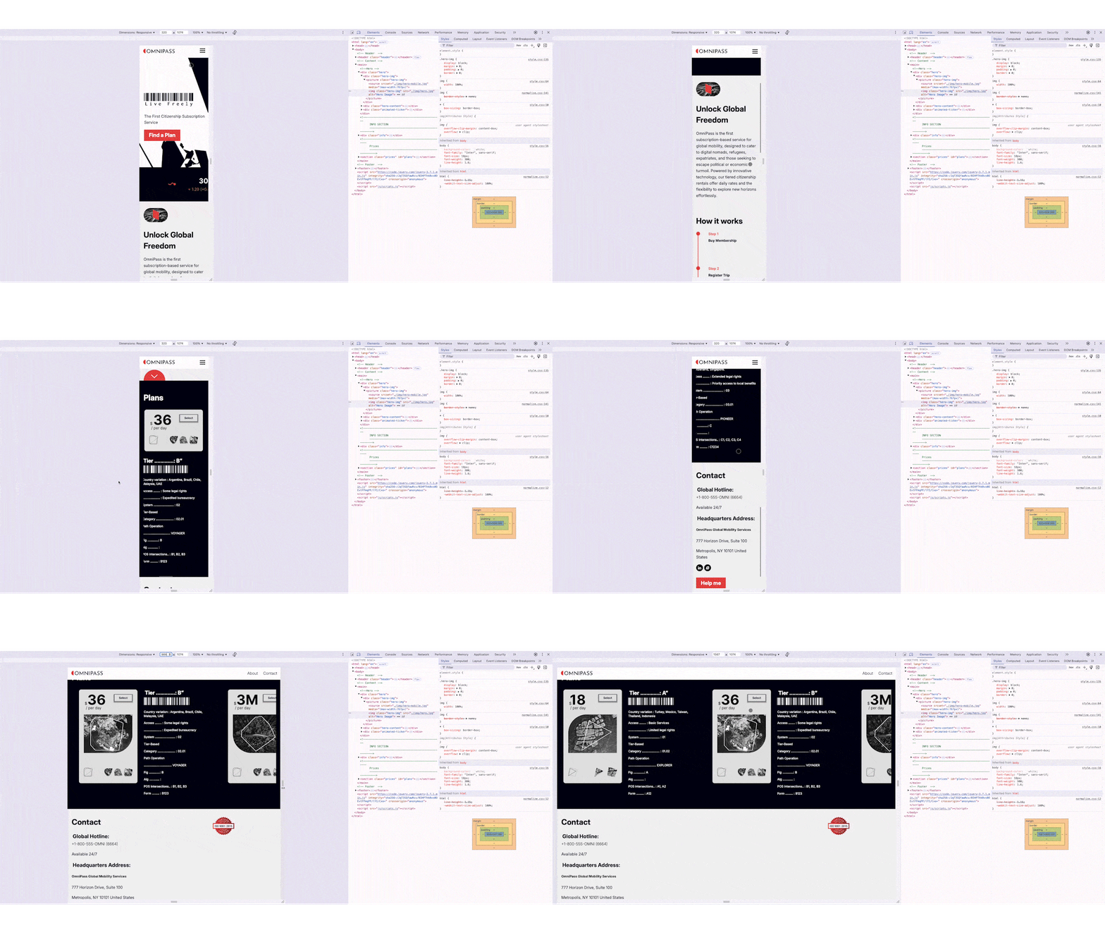
I took a mobile-first approach to keep things simple and make sure the design worked well for people on the go. My main focus was on making the design responsive across all devices. I use Visual Studio Code to write the HTML, CSS and JavaScript. I also use linters like HTML Hint and Prettier Code to ensure the code was properly formatted and error free.
My biggest challenges at this stage were:
Responsive Design: Aligning elements correctly across different screen sizes.
CSS Specificity: Managing styles for consistent layouts (flexbox issues).
JavaScript Integration: Correctly structuring HTML and adding necessary attributes.
HTML/JavaScript Debugging: Fixing stray tags and ensuring proper nesting.
Styling Inconsistencies: Applying styles consistently to multiple classes.
Testing
So, does it work?
I conducted a moderated usability study to evaluate if users understood how the service worked, they could choose a plan and complete the id verification on mobile and desktop devices. The study revealed users were often confused with the service offer, and were not sure what was included in the plan. Based on this feedback I set out to improve the design.
Issue #1
Unclear service offerings (Medium)
Before
All participants showed signs of uncertainty about the service offering and thought the site could be less static.
After
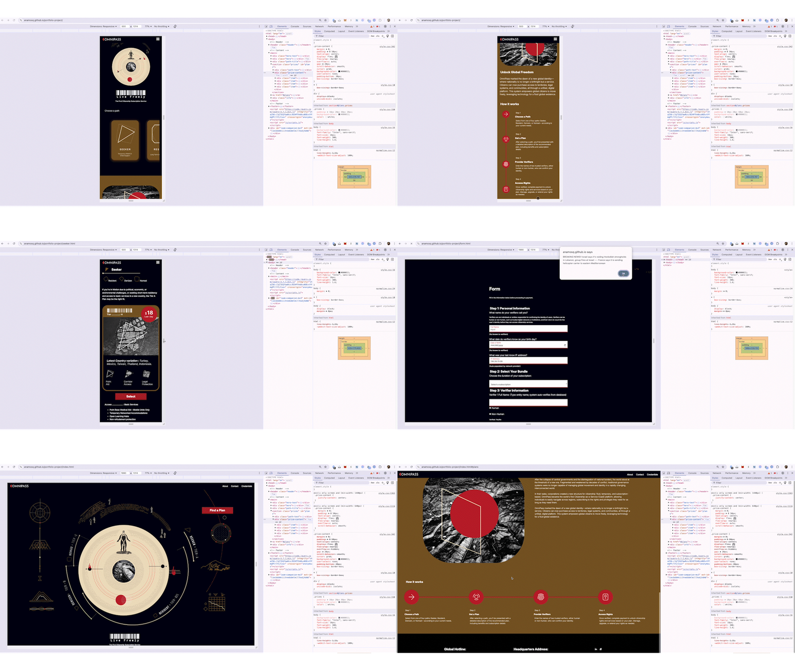
Change: Redesign expanded graphic elements and color palette, to improve emotional response and engagement.
Issue #2
Confusion over plan offering (Medium)
Before
Users expected that after selecting a plan on the homepage, they would be directed to a page with more details about the plan, rather than immediately being taken to the verification form.
After
Change: Providing each plan with its each its own page allows users to access more information about each option before proceeding to the verification form.
Accessibility compliance check
I used two color two color and type checkers WebAim Color Contrast Checker and the Accesible Colors Checker to optimize the website for accesibility
Debugging
